In Praise of the Pickpocket: Betrayal (At Club Low) and What Makes Good Animation Direction
- April 19 2024
- 4 min read

As an animator, you train your eye for observation. You might see a person gesticulate and note, “Oh, that’s an interesting hand motion!” or watch someone interact with an object and think, “I wouldn’t have thought to do it like that.” You collect all these observations and mentally catalogue them for future reference. Before long you also start to appreciate the immeasurably small ways other animators make decisions about their own work. Every now and then, those works come to you like small gifts, to cherish and carry around with you.
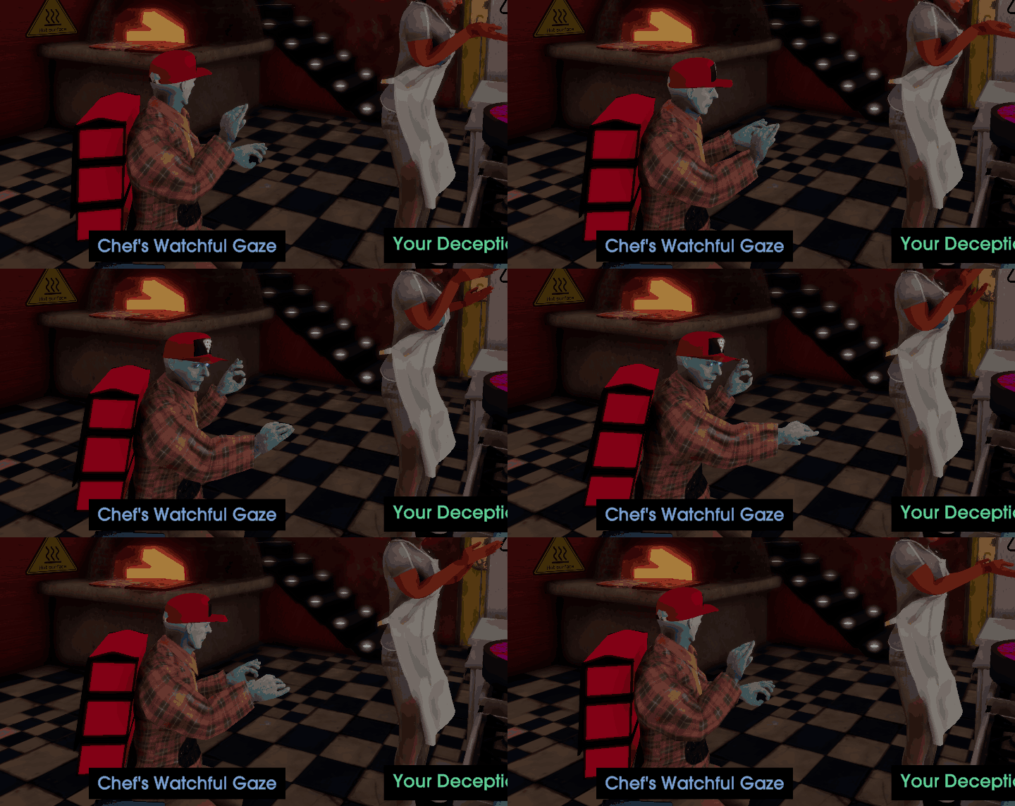
Enter the Pickpocket animation from Betrayal At Club Low (2022).

I mean, look at it! It’s fantastic. I had a good laugh when it first showed up and I haven’t stopped thinking about it, nearly one year after playing the game. The hand gestures, the head movement, the crouch… It’s comical in how conspicuously inconspicuous it is. Like a mime on a theatre stage, winking at the audience. It’s unabashed in its performance and I wouldn’t change a thing about it.
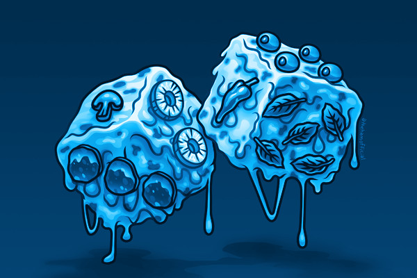
Let’s back up and explain a bit: in Betrayal, you’re attempting to infiltrate Club Low and rescue your comrade (trapped in the VIP lounge) by disguising yourself as a pizza delivery person. Your skills are cooking, deception, music, observation, physique, wisdom and wit. You collect and upgrade pizza dice by finding sauces, toppings and cheese, then roll those dice against opponents to resolve ability checks. Everything in this game is off-kilter and absurd (complementary), including the visuals.
And let me say, the animations on display in Betrayal are excellent. They absolutely nail the tone of the overall experience and still manage to surprise in really fun ways. Some folks might write them off as silly or unrealistic but they’re missing the point: this is exactly how they should be.
Read the Dice
I feel that there's a general misunderstanding about what animation direction is or how to tell when it's "good" or not. One of the few ways you can truly judge a work is by the visual foundation it sets for itself. To understand its grammar and syntax before being able to grasp the language. Then, once a game tells you what it plans on being, you assess how well it meets or defies those expectations. The same applies to how animators choose to convey movement.
Games like Uncharted 4 set an incredibly high bar for themselves to showcase an animation philosophy and style that feels true to life as a bridge to help players believe in these characters as real, living people. It’s their meticulous attention to detail that shines (in this case, literally. If you point your flashlight at Sam in chapter 9, for example, he reacts and looks away, even mid-dialogue. If you’re unsure why that’s such a big deal, try pointing a flashlight at an NPC’s eyes in most other games, see what happens).
Yet what the Uncharteds of the world are aiming for (or The Last Of Us's or Alan Wake 2) isn’t the ultimate goal of all game animation, broadly. It’s not a measure of success or sign of maturity as a medium when we reach a point that our works are indistinguishable from movies (it almost feels like the opposite, actually). Like the calls for greater “immersion,” it’s a trap, a hunger that can never be satiated. On a fundamental level, games will never be movies, as much as they aspire to be. And that’s okay!
Like with painting, as I've said before, there’s such a breadth of expression available to us in animation when you start to see it that way. How much can you convey with 2 frames of animation? With 20? How do the characters move? What moves them? And how does the animation further emphasize and amplify the core of what the rest of the work is trying to communicate to its players?
Faces and Pips
Take Mother 3, for example. The animation presents itself as something of a throwback. Games released concurrently were testing new tech and pushing the boundaries in interesting ways on the Game Boy Advance, but Shigesato Itoi and company didn’t see that as a way in for players. They wanted to appeal to a specific part of a player’s memories, to ease them in with something familiar, so that the emphasis could be placed more on the story and characters. The animation is constrained and limited... until they choose not to be for incredible emotional effect (IYKYK). The characters themselves are all fighting for their right to exist outside of a nostalgic framework that's being imposed on them by the game's antagonist. And when they're finally free? The screen goes black, and they continue to live in a space where they can no longer be observed and consumed for our enjoyment.
Pentiment, as another example, knows exactly what it’s trying to be and communicates that consistently through character and UI animation. Yet they don’t sacrifice animation fidelity here to achieve it. From the jump, its characters move fluidly and expressively, counter to the flatness of the world they inhabit. They choose to consistently fill their characters with life (especially in noninteractive scenes) to spotlight the people at the heart of this work: behind the manuscripts, the murals, and the game itself.
Lethal Company, as discussed in Campster’s excellent video on Zeekerss’ career so far, wants to make you laugh and scare you (the former a little more than the latter). The speed and stiffness of its animations are deliberate, and their direction contribute to that intended effect to great success, reinforcing the emotional tone of the gameplay. Realism would break the spell the game casts on you, it would detract from the humour of dying in a very sudden and silly manner. The shriek of terror that segues into a shriek of laughter is intended by its animation direction.
Final Roll
So what is Betrayal A Club Low saying with their animation direction? How does that reinforce the rest of the game? Betrayal presents all their animations like a dance. A conversation occurs between two people’s bodies as much as it does with their words. Their idle animations sway, shimmy and loop, they gyrate and swing, in a way that relates the act of negotiation to a series of absurd ritualistic motions, each one more ridiculous to the next.
And it clicked for me when playing this game. Animation isn’t all dance, but it is choreography. A dialogue between subjects and space, between bodies, between actors and their audience. Betrayal At Club Low understands that, on a deep level. And the Pickpocket animation, for me, is where it all came together.
